Please note: this project was while under full-time employment of Comelit-pac. I do not claim the work as my own but have contributed to the design & other areas during the time as the full-time Graphic Designer.
PAC & GDX is a UK-based access control and security management company. At the time, PAC & GDX was under the larger global parent company STANLEY Black & Decker under the security sector, however in November 2021 PAC & GDX was acquired by Italian security company Comelit Group. Once the acquisition settled, PAC & GDX became Comelit-PAC, which meant quite a number of items required a rebrand.
Once the priority items were rebranded, the team asked for my design expertise in rebranding their high-valued security software, PAC Access Central. The new brand identity needed to not only compliment the new Comelit-PAC branding, but also truly represent the values of the software that the previous brand lacked.
The Challenge
The company’s primary goal was simple: a bold new identity for their most popular commercial-focused software which clearly represented the values. With this, a number of departmental challenges had to be considered when looking into the objectives, including:
Sales & Marketing: New set of collateral such as brochures, flyers and digital graphics as well as brand guidelines.
Research & Development: Accessible and UX-friendly branding to implement in the software, including complimentary icons, fonts and colour scheme.
Tech Support & Product Management: A clear and concise branding relating to the key features and values of the digital product.
Research & Analysis
Before diving into the design, I first needed to research and analyse the software from the user’s perspective than my own as the designer. Based on the software, here’s what I discovered:
The PAC Access Central software is designed for commercial applications, with easy to install, maintain and report features to support the administrator of the access control within a business. A scalable solution enables PAC to provide quality access control from the Small & Medium Business (SMB) customer to large corporate/enterprise customers.
From this, we can look into the key focuses of the software and company combined:
Focused on Commercial Sectors • Scalable Solution • Ease-of-use application • High level of technical support
It Starts with the Sketch
Design Process
As mentioned previously, PAC Access Central needed a bold new look, one which provided a clean and professional visual identity focusing solely on its software and commercial values.
To follow alongside the focus within PAC and Access Central, the software needed an identity with the ability to adapt, ranging from one small software icon to a splash screen on a desktop.
Execution
Tools used for the creation of the branding was a pencil and sketchbook (and a bit of Adobe Illustrator!). Illustrator in my opinion is the best tool to use for vectors which provide endless scalability as well as ease of exporting to various file types (PNG, SVG, PDF etc).
Other tools used were XD and Figma to present UI proposals to the R&D team. The proposal allowed them to ensure the branding was cohesive and aligning to the brand identity, but more importantly provide support and efficient collaboration between the designer & developer.
Key Deliverables
The Logo & Brandmark
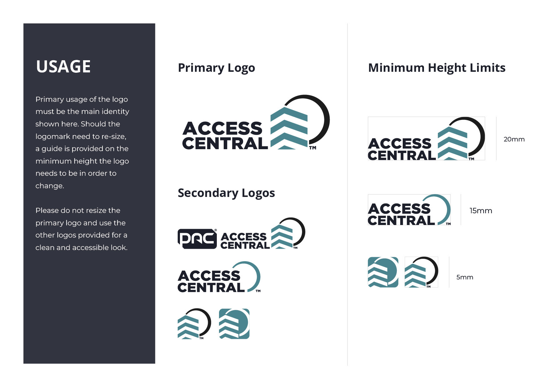
The brandmark of Access Central is a commercial building from a bottom-up perspective. This is to portray its endless expansion, development and forward-thinking.
As mentioned earlier, I kept the tradition of the centre-circle but with much more subtly. This circle is more of a loop which travels from one place to another, suggesting Access Central’s secure protection always, from the bottom to the top.
The Colours
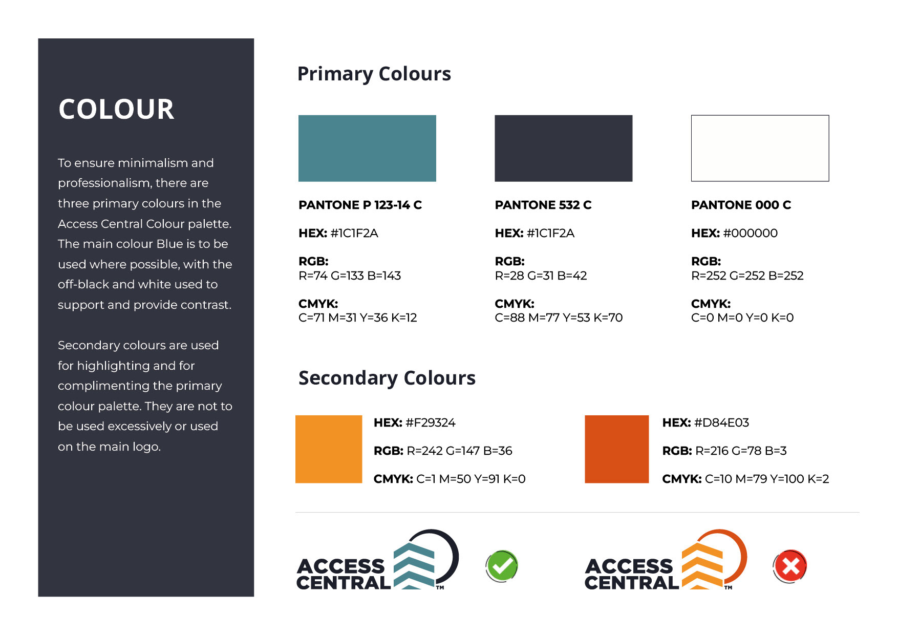
Following from the previous logo, PAC Access Central remained as a different tone to blue to symbolise reliability, professionalism and protection.
“Considered a highly corporate colour, blue is often associated with intelligence, stability, unity, and conservatism.”
As other departments would be using the rebrand, I kept all colours as Pantone colours. For example, P 123-14 C is a Pantone shade of Teal Blue, meaning its colour will remain consistent both in RGB (digital) and CMYK (print).
Brand Guidelines
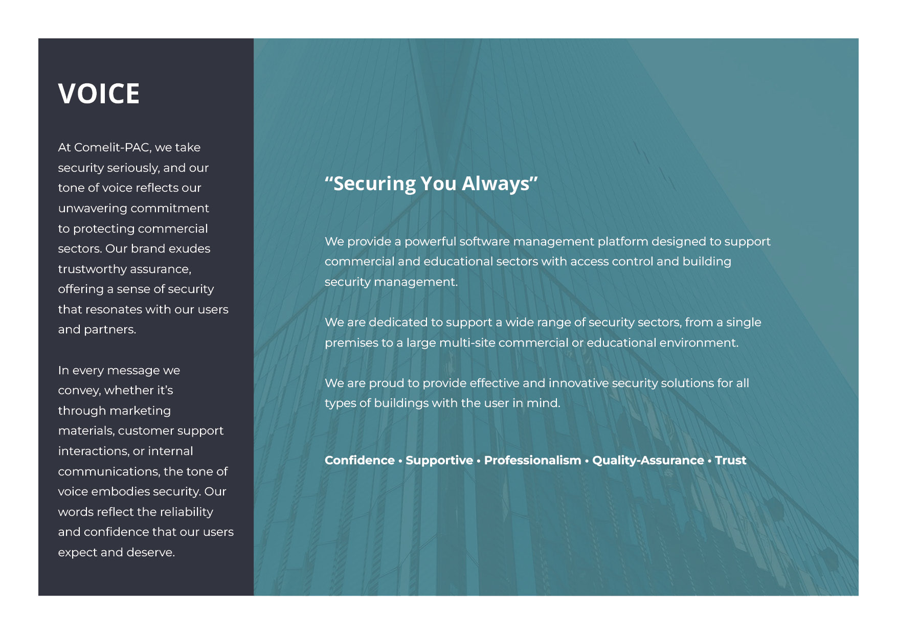
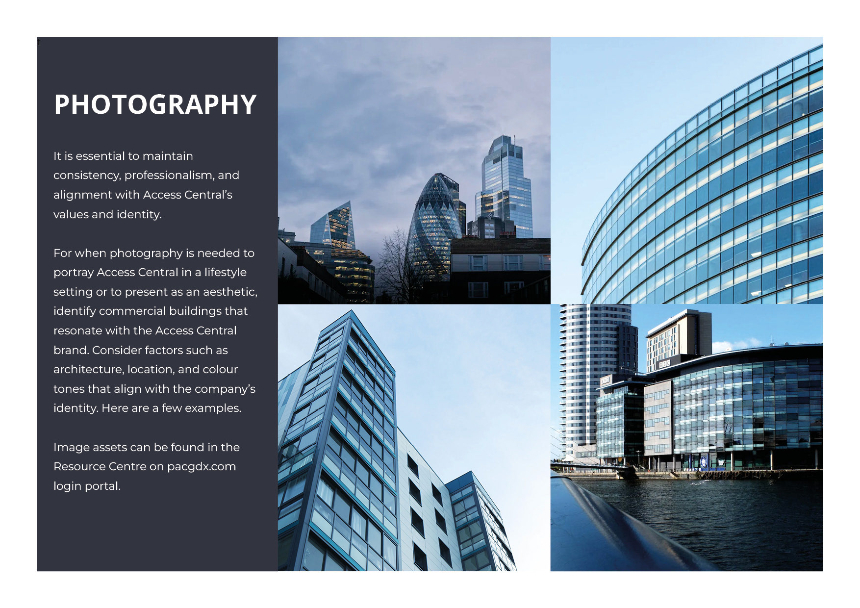
Once the proposal was approved, brand guidelines were then created to ensure the brand identity is presented for consistency, as well as provide an easy guide for those using the branding. This file was distributed to the relevant departments with my contact details for if they had any questions or required support.
Results & Impact
The re-brand of Access Central was certainly quite the change. Not only was it now a new fully-flexible identity focused on the software’s values and key factors, but it also now told a story to users and the target audience.
One of the main successes was the new and improved level of support the brand identity brought to those departments using it. For developers, the identity can withstand new sizes and colour changes for better accessibility, for sales & customer-facing departments, the identity brought a more story-telling feature for presentations and marketing collateral. Accessibility and user-experience doesn’t stop at looks, it needs to support those behind-the-scenes also.
Challenges Overcome
When the new brand identity was launched, an online resource centre was made for team members to access all files. This included all logo file variations from colour to size in various file types such as PNG to EPS, photography assets, icons and brand guidelines.
However, we came to notice many departments were creating technical documents and other niche materials which lacked in aligning to the brand guidelines. With this, the design & product management team planned a meeting to discuss how we could create templates and other master documents for team members to use with ease and efficiency.
Once we overcame this challenge, I managed future communication with all departments regarding the new brand identity, from the introduction to any support team members required. I also continued to assist in any software updates which involved a design aspect and collaborated with relevant development team members to ensure the branding of Access Central was aligned to the guidelines.